Certum-website
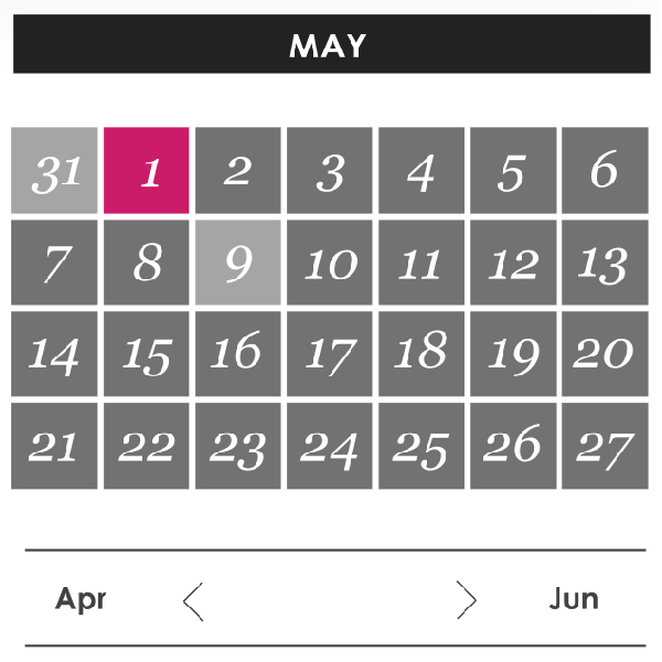
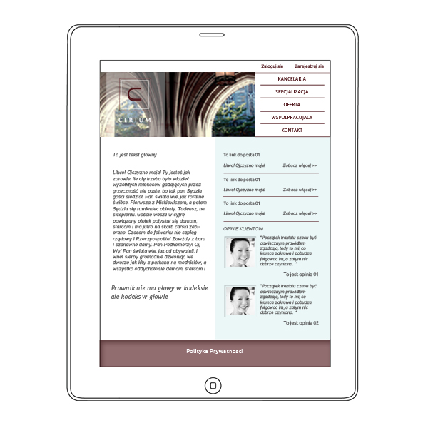
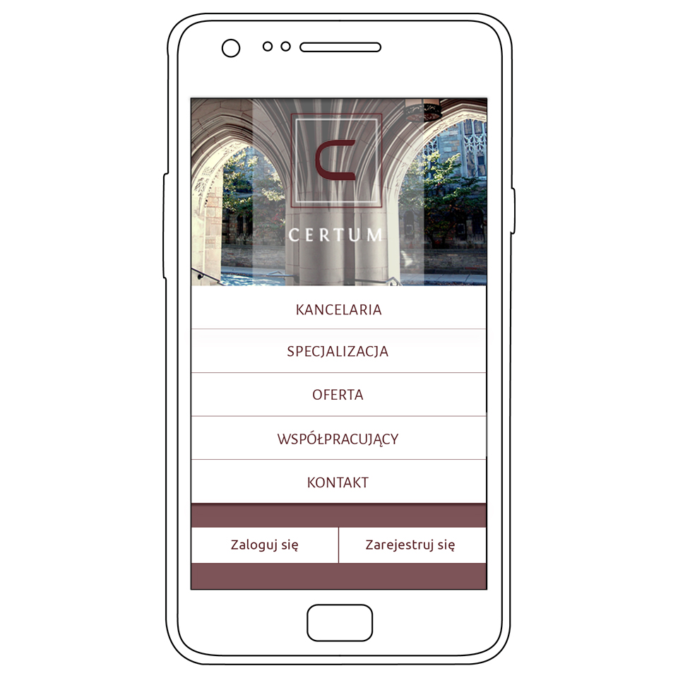
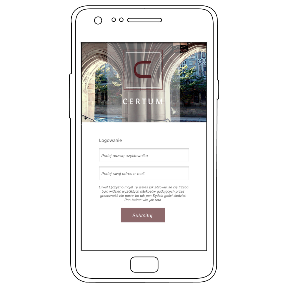
For this website I've created a grid based on modules, relevant to logo size. Modules are adapted for responsive layout, which can be seen on the structure wire-frames as well as design ideas below. The website content such as client log in options and blog feed has been also adjusted to fit mobile and tablet devices. Thanks to initial grid the blog page gained extra space for advertising purposes as well as extra functionality such as newsletter and embedded form in the main page. Blog navigation suggestions involved a calendar solution with on hover content preview.
Initial projects:
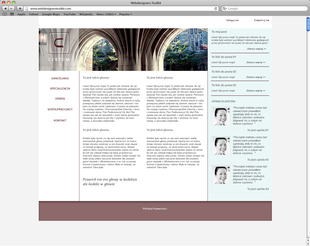
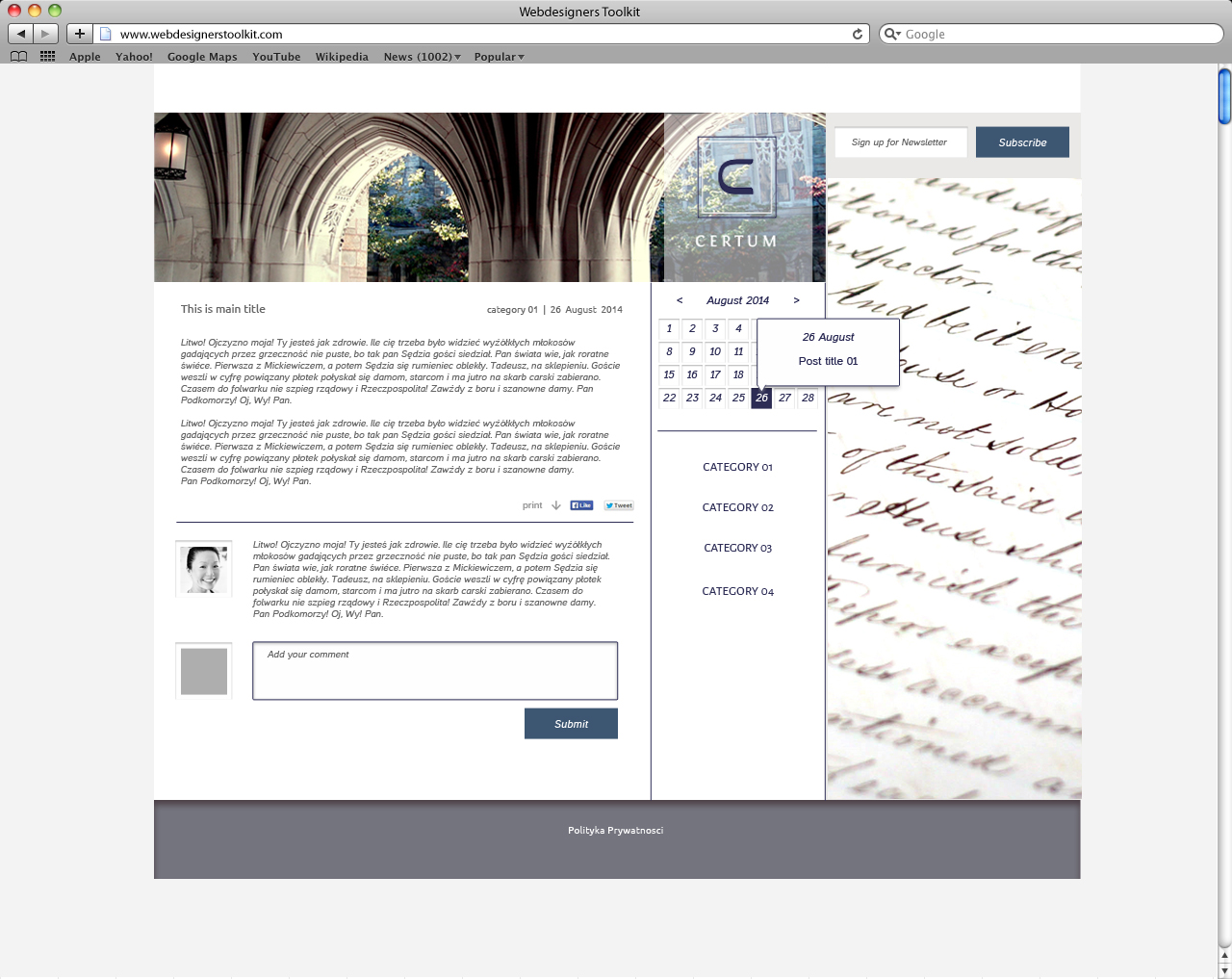
Responsive preview:
Web view
Tablet view

Mobile view
Case studies
Click images below to see more details about the projects. Filter them by date or category with following options:
About
CDOOpen Knowledge'Ewelina designed and created a website, which mirrors our 'from design to final brushstroke' philosophy. The website is characterised by a clean layout, intuitive navigation and high-quality imagery. Ewelina's minimalist style led to purposeful marketing materials design.'
Marian Grybel, General Director at CDO GmbH
'Ewelina completed some work for Open Knowledge, working on designs and code to support some website improvements and laying out some reports for us. Ewelina is a conscientious and hard worker, who shows real commitment to her work and will push herself to do her best work possible'
Jo Barratt, Project manager at Open Knowledge
Co&Co UK'Ewelina is talented designer and great to work with. She's very innovative and always looking for a new solutions and fresh ideas that can advance her knowledge to exceed clients expectations and goals. Ewelina is a passionate designer and always seems to have great awareness of new creative strategies and technology. Highly recommended.'
Alicja Alchimionek, Founder & Head Designer at Alchimionek
'Ewelina worked at coANDco in design and user experience. She is a pleasure to work with and she is very talented. She helped us creating and illustrating mobile user experiences for large brands which impressed our clients.
Christoph Burgdorfer, Managing Director, Partner, Founder, coANDco (UK) Ltd
I can highly recommend Ewelina as a creative, talented, keen and ambitious member of any team!'
